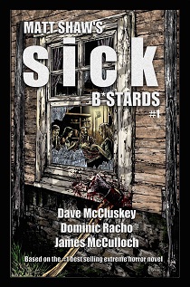
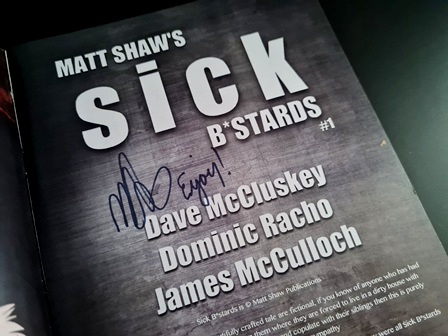
First published in October of 2016, issue one of the graphic novel adaptation of British author Matt Shaw’s controversial extreme horror novel ‘Sick B*stards’ (2014) was adapted by Dave McCluskey with artwork by Dominic Racho and lettering by James McCulloch.
DLS Synopsis:
They’d woken up in the car. Father surmised that the force of the blast must have knocked them all out. That must have also been what took their memories too. Some kind of reaction to the shockwave. Whatever the reason – none of them knew who they were or why they were where they were.
Try as they might, as the days slowly passed by, their names never came back. Father had found a photo in their luggage showing the four of them together. A family. Nevertheless, despite not being able to remember their names, they didn’t want to give themselves new ones in case their real names eventually came back to them. So they stuck with the descriptive ones they’d been using so far – Father, Mother, Son/Brother, Daughter/Sister.
They’d found themselves a nearby house which they’d been hiding away in ever since. Food was already getting low. Soon they’d have no choice but to venture out in search of more supplies. But Father was scared of looters. In times like this he knew people often did whatever it took in order to survive. People would steal and kill without remorse - just to last that little while longer. So they had to be wary of others. They had to stay hidden and stay alert.
They knew there were others out there. Father and Son had already been attacked by one of the infected. The man appeared to be rabid. Discoloured flesh and messed-up eyes. And such a rage. They’d done what they had to do. They’d done what anyone else would have done in order to survive.
But food was running out. Tough decisions lay ahead. Tough choices. The old laws no longer meant anything. It was time to cast aside morality and look at the bigger picture. If they wanted to survive they would have to change. And in doing that they knew nothing would ever be the same again…
DLS Review:
This review’s going to assume that you’ve read Matt Shaw’s original novel. If you haven’t – personally I see absolutely no reason whatsoever why you wouldn’t get the full enjoyment from reading the story the first time around in this format, as and when they’re released onto the unsuspecting world. However, for the sake of the reviews I’ll be doing of these graphic novel adaptations, I’m not going to cover old ground with reviewing the actual story (which I will say is an absolute fucking corker). For a full in-depth review of the original novel you can go here: ‘Sick B*stards’ (2014). So anyway, this review’s purely for the first instalment of the graphic novel adaptation.
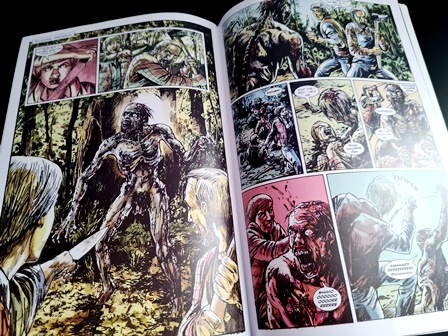
I must admit that prior to seeing how the first instalment of the comic version had come out, in my head I had my own idea of how I thought it should look. Inside the family’s home I saw dirty, washed-out colours, with grit and grime seeming to seep into every living and inanimate object. Outside their barricaded-up false haven, a world of rich vibrant greens and browns – subconsciously symbolising ‘the world that they’ve left behind’. A world that now been left to carry on without mankind’s corrosive and corruptive touch.
For the linework I hoped for an attention to detail, but nevertheless a rough and ready urgency to it all (oh yes…I’m full of contradictions). The story is the epitome of raw grittiness – this desperately needed to be conveyed in the artwork. Absolutely no smooth, comical charm could spill into the art if it was to remain true to the original story.
Fair do’s to Dave McCluskey – it seems he had the very same thoughts and furthermore he’s managed to pull all the right people together (as well as utilising his own skills at adapting the story) to absolutely nail it. I have to be honest – I couldn’t be happier with how this nasty little story has come out in this new format. ‘Sick B*stards’ (2014) is one hellishly entertaining beast of the read. It’s one of those novels that stays with you, like a corruptive infection that lingers on at the back of your mind. Because of this you really want any further additions and adaptations to do absolute justice to the original fucker. On both accounts I have to say that Shaw’s (so far) by luck, skill or just plain old good judgement, achieved this to perfection.
For those who know the story already, the comic (well issue one at least) stays very true to the original tale. As with Shaw’s original – the timeframe jumps back and forth between when the family first arrived at the house and the present time. Each switch between timeframe is cleanly split, with small boxed-in titles referencing if it’s now the ‘Present Day’ or not, to ensure absolutely no confusion.
The storytelling (like with the original tale) is again provided half-and-half between the internal monologue of ‘Brother’ (the tale’s principal protagonist) and the dialogue between the family members. The monologue is cleverly given a distinctive yellow wash to clearly differentiate it from any dialogue or other titling. Again, a simple technique, but one that just makes the whole reading experience of the graphic novel that much easier (and to that effect that much more enjoyable).
Going back to Dominic Racho’s illustrations – I really can’t emphasise enough how suiting his artwork is to the story. The (numerous) scenes of ‘incestual’ sex, in all their lurid glory, make you feel genuinely uncomfortable. The scenes of cannibalism are hard-hitting and gut-churningly grotesque. Trust me on this one – Racho doesn’t pull any punches whatsoever with his illustrated portrayal of any of these scenes. Expect thick cut lumps of human flesh, dripping with blood and gore, being eagerly chowed down upon by the four residents of fucked-up-ville. And that’s not to mention the steamy ‘Brother’ and ‘Sister’ scenes that we’re also treated to!
The lettering’s top notch too. Admittedly I know diddly-squat about lettering. To me (the proverbial untrained eye) it looks exactly like the lettering in all other professionally produced graphic novels. And I’m guessing that’s kind of the point. Easy to read. Professional.
However, for me the real winning strength to the artwork is in the colouring. Oh how Racho’s nailed this. Hand on heart I couldn’t of envisaged a better job of colouring for these graphic novels. Washed-out, dirty, rotten colours bleeding into each other. Browns and dirty blues infiltrate every fucking dank corner of the interior of the house. It’s just as you no doubt would have imagined. Dark. Dreary. Gloomy as fuck.
Holy shit this review is turning into a fanboy gush of near-delirious praise. I’d better reign in the compliments in order to save face somewhat.
Shaw / McCluskey / Racho / McCulloch – it’s turned out pretty good.
Issue one of the graphic novel runs for a total of 26 pages (along with a number of supplementary covering pages / adverts and a humorous afterword from McCluskey and Shaw).
© DLS Reviews
Other ‘Sick B*stards’ instalments:
- ‘Sick B*stards’ (2014)
- ‘SickER B*stards’ (2014)
- ‘SickEST B*stards’ (2015)
- ‘Sick B*stards: Issue One’ (2016) [Comic]
- ‘Sick B*stards: Everywhere’ (2024)


PLEASE NOTE: As an Amazon Associate, I earn from qualifying purchases.